 Log In
 Register Now!
 Help
Help

Hello and a good evening <_<
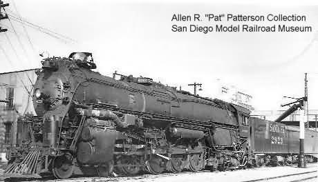
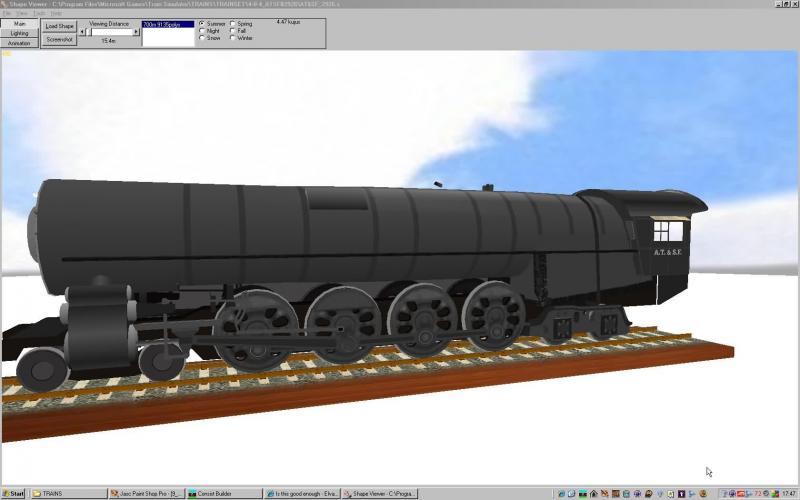
The ATSF #2925 renumbered to #2926 is nearing completion. I'm asking for opinions as to whether
this locomotive and tender look the right color for a working over the road unit. I've painted this "Rasa
Fratsa" thing a dozen or more times and you would have to say(why did he even bother or he better go
back to art school or he shoulda taken up singing) :whistling: it looks awful. But it's the best I can do. So
oooooo! Whatia think? Should I leave it this way or should I seek professional help. B) Are there people
out there who love the aggravation of painting a steam locomotive. If anyone is interested let me know.
Allen
Is this good enough
opinions please
Rate Topic:

#1

- Vice President
-
- Group: Status: Elite Member
- Posts: 2,354
- Joined: 14-May 08
- Gender:Not Telling
- Location:New York State
- Simulator:Open Rails
-
Country:

Posted 15 August 2008 - 04:57 PM
#2
- Senior Foreman of Engines
-
- Group: Status: Senior Foreman, Engines
- Posts: 1,797
- Joined: 22-April 06
- Gender:Male
- Location:Mystic, Connecticut
- Simulator:ORTS-V1.5.1
-
Country:
Posted 15 August 2008 - 05:30 PM
Allen:
I'll leave it up the "wide-gauge" guys to chime-in, but I'd say she looks fine to me . . . sweet! :whistling:
Light gray on the top, dark gray on the bottom, and round-parts-down.
BTW, Ol' Eagle-Eye Kelsey has a habit of puttin' the round parts up!
I'll leave it up the "wide-gauge" guys to chime-in, but I'd say she looks fine to me . . . sweet! :whistling:
Light gray on the top, dark gray on the bottom, and round-parts-down.
BTW, Ol' Eagle-Eye Kelsey has a habit of puttin' the round parts up!
#3
- Superintendant
-

- Group: ET Admin
- Posts: 1,430
- Joined: 28-May 05
- Gender:Male
- Location:I'm homeless.
- Simulator:ORTS
-
Country:

![]() Posted 15 August 2008 - 05:31 PM
Posted 15 August 2008 - 05:31 PM
Hello Allen
Hey Buddy that looks great. :whistling: It will find a welcome home in My round house. B)
Cheers Tony <_<
Hey Buddy that looks great. :whistling: It will find a welcome home in My round house. B)
Cheers Tony <_<
#4
- Executive Vice President
-

- Group: Status: First Class
- Posts: 4,643
- Joined: 25-February 05
- Gender:Male
- Location:San Diego
- Simulator:ORTS
-
Country:
Posted 15 August 2008 - 10:56 PM
Looks pretty good! The freshly painted pilot wheels and tender trucks need to be toned down a bit but otherwise she looks pretty good. Like a working engine. That smokebox front seems to have too pronounced a bulge. The prototype was flatter. Is the .s file your own?
#5
- Fireman
-
- Group: Status: Active Member
- Posts: 141
- Joined: 24-March 08
- Gender:Male
-
Country:

Posted 16 August 2008 - 02:12 AM
Hallo!
I think the paint job is fine as it is. I think its a good compromise between deep black and detail visibility. I wouldn't worry too much of the color not being prototypical. There are so many shades of black and grey with steamers in reality depending on light and many other things. I'm really looking forward to see your fine engine on my Santa Fe routes.
Keep on steamin'!
Dietmar
#6 Inactive_Locopainter_*
Posted 16 August 2008 - 03:31 AM
 B & O GUY, on Aug 15 2008, 04:57 PM, said:
Are there people out there who love the aggravation of painting a steam locomotive. If anyone is interested let me know.
Hi Allen - first, a big thank you for your shapes.
Some paint jobs turn out good first time and some are long term members of the needs-more-work-club.
Several variables involved in why some come good - including a decision whether you want (1) brand-new from the paint shop, (2) working engine look so dirty weathered and smutty or (3) old engine look with heavy weathering patina rust and dents. What doesn't work is mixing the three. BTW excursion/museum locos are very tricky. Next decisions are to bite the bullet and always have a gradient from dark to light areas (without over-doing it especially on 2 and 3), other gradients from say dirty oily recesses to cleaned polished areas, and being prepared to change the tex pattern by experiment and spending a lot of time making small incremental changes until a whole loco look comes.
My late father was a professional photographer and could do extraordinary things in the pre-computer era just using shading, contrast and the odd retouch. He used to say that people saw what they expected to see - steamliners like the Blue Goose look wrong when depicted rusting away without rods waiting for the torch, the context is wrong. If you would like me to try and give 2926 some more definition so as to appear maybe less model-like please pm me. The best way I know of saying "this is what I want" is to have a good photo of another engine whose overall look you want to imitate.
EDIT: work on some gradients and texing on 2926 for (1) above is in progress. Pics later.
This post has been edited by Locopainter: 17 August 2008 - 02:10 PM
#7
- Member since Nov. 2003
-
- Group: Status: Elite Member
- Posts: 9,514
- Joined: 22-November 03
- Gender:Not Telling
- Location:Somewhere on the Beautiful Oregon Coast
- Simulator:Open Rails Only
-
Country:
Posted 16 August 2008 - 03:04 PM
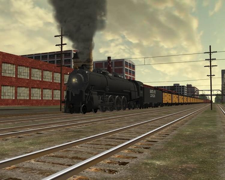
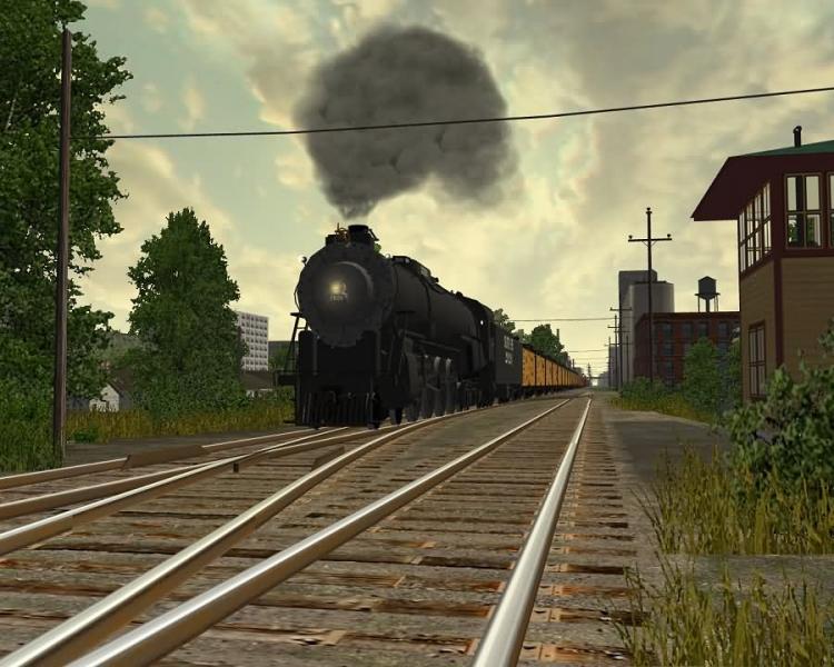
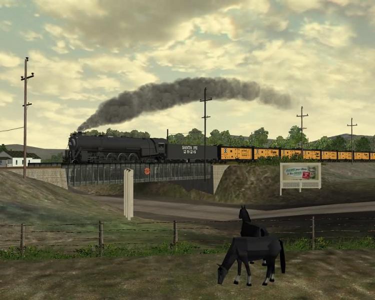
The shapes are very well done on this model, Allen. Here's some scenes of the beta at work...
#8
- Vice President
-
- Group: Status: Elite Member
- Posts: 2,354
- Joined: 14-May 08
- Gender:Not Telling
- Location:New York State
- Simulator:Open Rails
-
Country:
Posted 16 August 2008 - 06:51 PM
Tim
Those are beautiful shots. I've already saved then into my "Tim Muir Album" of fabulous screen shots.
Some day your name will be pronounced with the same breath as "Thomas Kinkaid" the painter. You'll be
getting a new shape file tomorrow as I followed Herb Kelsy's recomendation of shortening the smoke box
front. Yeh! You got it. Another headlight change.
That loco really looks good with your period reefers and boxcars and the scenery fits the good old days.
Back before "OSHA".
#9 Inactive_Locopainter_*
Posted 18 August 2008 - 07:48 AM
Allen has decided to release 2926 as is. The eng file had some errors however. Anyway, here is a pic of how far I got - some mistakes and just gradients - no texing on boiler and smokebox. Allen told me the smokebox is same color as boiler so I re-scaled mapping to line up smokebox and boiler. A fine model by a fine shape maker.
EDIT: Since I am bound to be asked "what errors" by downloaders: water injector size was set for a switcher when mid-range for a model as big as this is about 20 20, line for SteamFiremanMaxPossibleFiringRate is missing and needed increasing as default was for switcher, extra unneeded line for InjectorLimit can be deleted and adheasion was far too high for 255 tons. Power was set at over 5000kW, I reckon about 4000 is in line with 3000 for a Mountain and 4500 for a Challenger but I know some people set their fleets up or down......
EDIT: Since I am bound to be asked "what errors" by downloaders: water injector size was set for a switcher when mid-range for a model as big as this is about 20 20, line for SteamFiremanMaxPossibleFiringRate is missing and needed increasing as default was for switcher, extra unneeded line for InjectorLimit can be deleted and adheasion was far too high for 255 tons. Power was set at over 5000kW, I reckon about 4000 is in line with 3000 for a Mountain and 4500 for a Challenger but I know some people set their fleets up or down......
This post has been edited by Locopainter: 18 August 2008 - 02:00 PM
#10
- Vice President
-
- Group: Status: Elite Member
- Posts: 2,354
- Joined: 14-May 08
- Gender:Not Telling
- Location:New York State
- Simulator:Open Rails
-
Country:
Posted 18 August 2008 - 10:52 AM
Locopainter
I don't want you to take what I said the wrong way. I didn't say you couldn't paint it. In fact I'm
looking forward to having you paint my lokey. But for now a few people like it this way. And it is
summer here. I've spent most of my summer trying to get this thing done. It's time for swimming
and fishing and drinking gin and tonic. When the cool weather returns, "AND IT IS SURE TO RETURN"
I will be more in the mood for modeling and talking about paint.
Your work is most amazing. Obviously you using Glosmap or specular shine. Is there a way to have
a little less shine. With the shine you have in the pix I would think it would need to be much more to
the black than a gray. And it does look like I would have to do a lot of remapping.
Anyway. Don't be mad at me. I just need some sun.
Allen
This post has been edited by B & O GUY: 19 August 2008 - 06:34 AM