ShortNorth, on 28 October 2019 - 05:28 PM, said:
Hi all,
I note that there has been a LOT of discussion regarding the HUD and what information should be presented to the user.
Can I possibly throw in another comment, which may or may not be relevant.
In all my 60 odd years of involvement with the hobby of railways, and over 18 years with MSTS/OR in route and stock development, I have always only seen and used expression of gradients as '1 in 40' etc., rather than as a %age. Acknowledging that the US is always expressed as %age, and the UK and Australia is generally expressed in '1 in 40', would it be possible, or even desirable, that in the appropriate HUD sections that gradients be shown in BOTH %age and 1 in 40 format. This would be good for users from all continents and countries, showing their 'normal' designations. From a personal note, I find it difficult to visualize a grade steepness when expressed as a %age.
If I'm out of line here, tell me to pull my head in !
Regards, Brian Bere-Streeter
Hi Brian,
We're all friends - with the same interests - please don't ever feel hesitant about posting - that's what we do here - talk about things and exchange ideas...
Sounds like a good point - I pretty much play in my own backyard - so getting a different take from another part of the world is most valuable - especially when attempting to design something for a global community...
Perhaps we could change the Gradient format when switching between imperial and metric systems of measurements ?
Genma Saotome, on 28 October 2019 - 07:24 PM, said:
FWIW the human eye can discern far more differences in green than anything else.
Anyway, the issue of color to signify information becomes a bit of problem for those people who are
- red/green colorblind
- blue/yellow color blind
- all colors colorblind
None of which apply to myself but there are a few people on this board for whom it does apply.
I would expect googling colorblindness might turn up some suggestions on what to put on offer for those for whom this matters and if personal time allows for a bit of extra work it probably would be quite considerate to code some selectable alternatives for those folks.
Oh, one more thing: it's been shown that serif fonts do work better for reading text but non-serif fonts are better for numbers. I've played with this in numerous excel spreadsheets and concluded whoever did the research got it right. No idea why it is so.
Hi Dave,
Great stuff - thanks for the input - color blindness did cross my mind while working on this but no aspect of color is integral to the use of the HUD - we're not asking anyone to identify the "Yellow" shape - we're simply improving the color aspects for those that do see them... Track Viewer on the other hand requires you to differentiate between Red, Yellow, and Green signal states - perhaps we need to embed some unique identification shapes in those lenses ?
Oh - you’re right - the Steam Surplus/Deficit color change would prove problematic to the color blind (although that’s how it exists currently) - as that’s essential to running a steam locomotive... My previously proposed graphic gauge - for same - could solve that though if implemented...
Genma Saotome, on 28 October 2019 - 07:41 PM, said:
Another one more thing :whistling: ... years ago Hewlett-Packard (where I worked) admitted to itself that letting the software people come up with their own abbreviations often led to misunderstandings when people changed assignments. Believe it or not a group of 8 high level programmers from around the world were tasked to determine if there was a sensible, easy to understand standard way to abbreviate any word and much to the surprise of many who rolled their eyes when first hearing of this effort, there was.
The primary rule was to (in general) to drop most vowels and strive for word abbreviations to be 3-5 characters. There were a couple of corner cases of which I can recall only one: Very common words that ended a name were listed as 2 characters. There were pretty business specific so no matter here.
So things like Part_Number became PRT_NO, Customer_Number was CUST_NO and so on.
The analysis team wrote up several thousand abbreviations covering most situations and staff was told to use them starting right now, no snide comments or belly-aching. In time most everyone came to agree it was a positive change (tho a few of the standard abbreviations did seem a bit off).
I mention this in wondering if it might be relevant to this matter. Things like Fuel remain as is (in caps) because it's 4 letters. Boiler Pressure could be BLR P, speed as SPD and so on.
There is also the not so small matter of language conversion away from English. Having a simple rule like dropping vowels might be useful there too (excepting Arabic and Hebrew).
Hi Dave,
Yeah - the translations will be an issue to make them relevant to the language in use... We'll need a matrix for each language it's ported to...
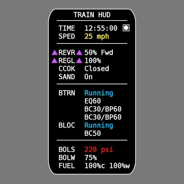
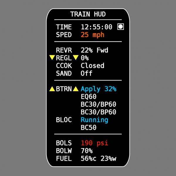
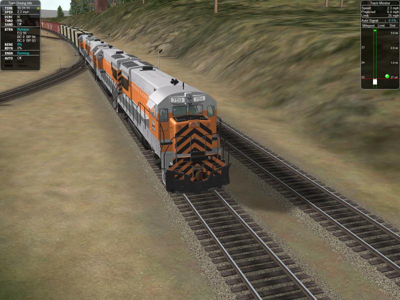
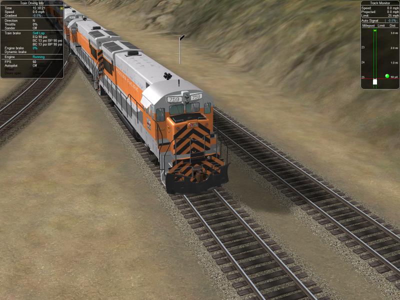
Yep - that's why I posted the complete list of proposed abbreviations early on - for peer review and open discussion for modification... I did try to keep the same formatting like BTRN, BLOC, BDYN for some consistency... The four characters were chosen simply to keep the HUD in alignment while still conveying enough information to easily make their intended meaning known...
I spent over 8 hours on the weekend testing both HUDs for an equal amount of time - trying to be as unbiased as humanly possible - and the "Abbreviated HUD" seems to have far better ergonomics - as having less clutter made it quicker and more efficient at locating the information you're after - at a glance... The same should prove abundantly obvious to anyone that puts in the time...
Regards,
Scott
 Log In
 Register Now!
 Help
Help