Here is my refined proposal.
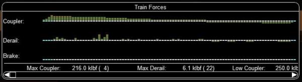
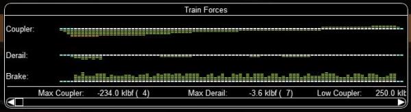
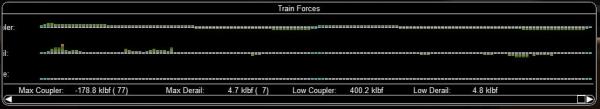
There are 9 bars on each side of the graph, 4 green, 3 yellow, 2 red. In the center line, blue indicates an engine, white a wagon.
Coupler Bargraph: Shows the length-wise (longitudinal) force at each coupling (rear of each car). This is equivalent to the "Coupler" column in the Forces HUD.
Up means pull, down means push.
The graph's scale is determined by the weakest coupler in the train. Thus, red bars may not be a problem if they are not at the car with a low coupler strength.
The scale is non-linear to show more details at the top of the scale.
Derail Bargraph: Shows the sideways (lateral) force at each car (at the wheel flange). Up means pull to the inside (risk of stringlining), down means push to the outside (risk of jackknifing).
The graph's scale is determined by the car (wheel) with the lowest vertical force (which is proportional to its weight). Thus, red bars may not be a problem if they are not at the car with a low force to derail.
The scale is non-linear to show more details at the top of the scale.
Brake Bargraph: Shows the brake force exerted by each car. This is equivalent to the "Brake" column in the Forces HUD. This graph only has an up part.
The graph's scale is determined by the car with the lowest brake force (which is proportional to its weight). There are no yellow or red bars in this graph.
The scale is non-linear to show more details at the bottom of the scale (ie. small application of the air-brakes).
Text Line: Shows the highest coupler and derail force in the train, and the car (number) where the highest force is. The line also shows the coupler-break force of the weakest coupling, and the derail force of the car with the lowest derail force.
The window
scales with the length of the train. It has a minimum size (showing the two peak forces), and a maximum size of 1028 pixels. Longer trains require scrolling (shown in the second below).
Notes:
- An alternative would be to scale each bar relative to the car it represents. This would then indicate the risk, rather than the force. The Forces HUD uses this approach for the Derail Coefficient. I prefer showing the force.
- I also considered showing the slack as a graph. But I feel the coupler force graph sufficiently represents if the coupling is expanded or compressed.
- I would have liked to show the grade with the longitudinal force and the curvature with the lateral force. But this is challenging to do with the limited space avaliable for a popup (used while driving).
- The colors are stronger and more distinct in the simulator (than in the included images).
- For details see this PR in my repo.
 Log In
 Register Now!
 Help
Help


 C44-9W, on 20 May 2024 - 10:43 AM, said: