Log In
 Register Now!
 Help
Help


Weter, on 05 April 2021 - 10:46 AM, said:
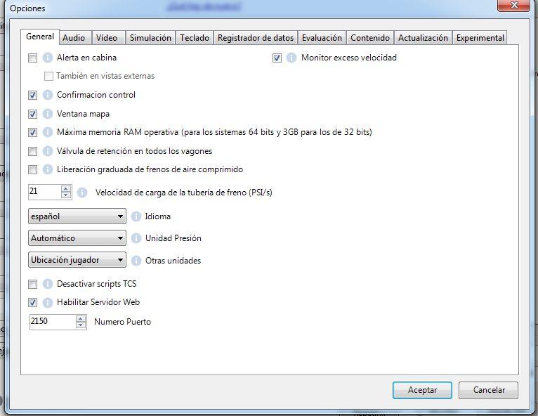
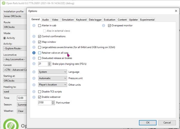
Blue circles with an "i" inside cover the initial letter(s) of translated titles for options
As the text strings are started from very checkboxes.
Maybe link-like design is better (when underlined text become blue when the mouse pointer points on it, and opens web page when clicked with mouse)?
As even before, there where not enough space for Russified variants.
As the text strings are started from very checkboxes.
Maybe link-like design is better (when underlined text become blue when the mouse pointer points on it, and opens web page when clicked with mouse)?
As even before, there where not enough space for Russified variants.
I shall try it again with the the blue circles moved from the right side of the control to the left side of the control. That should keep them away from the text.