delamate, on 23 January 2017 - 02:26 PM, said:
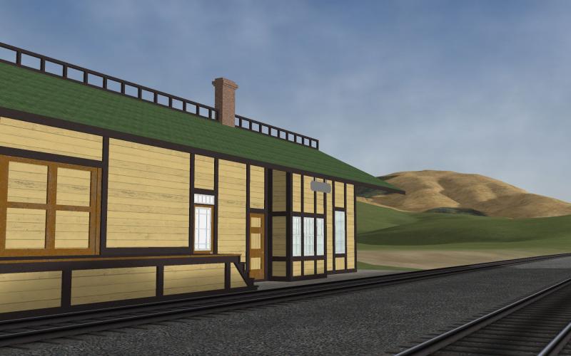
I am interested in your debate over the color of the various sections (walls, roof) of the station building. have scratchbuilt many SP cars and buildings over the years for my HO scale SP layout, and have struggled with how to get the correct color.
Unfortunately I don't think there is a simple solution. Almost everything will depend on the quality and intensity of light. When I was into HO Scale I did my painting outdoors, but of course you cannot match that inside so right off the bat there was a problem. >90CRI, 6500Kelvan lamps helped but of course they lack the proper intensity and corners were just hopeless.
On the computer I do believe having a calibration device for your display is a requirement. I also have a very good monitor as far as color rendering is concerned.
I find V-Scale vastly easier to do color work; If it doesn't look quite right it's so easy to change... 10% lighter, 15% denaturation, whatever. You have to have software that provides you with n number of layers you can paint upon along with varying the opacity of whatever you do. Having software that has special functions to blend layers in interesting ways is a wonder.
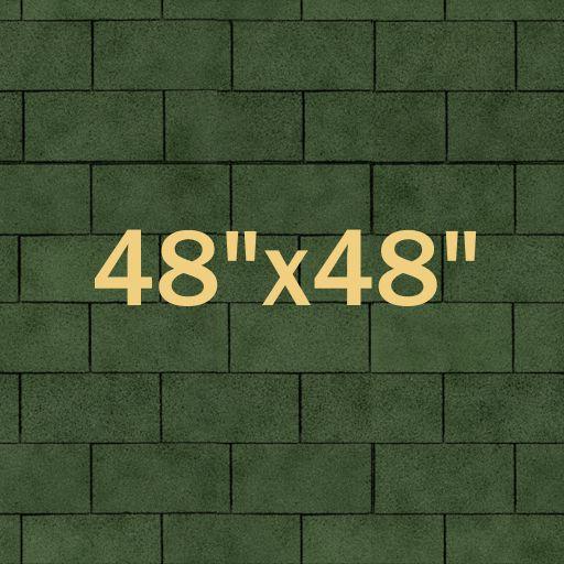
Perhaps a willingness to go back to an earlier model and change out something helps too. As an example, after using one set of shingle textures for a number of years I completely re-did them this past week. I did this:
Base layer (w/o the size info of course).
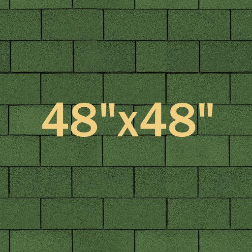
Second layer - the above, overlaid by a fully saturated shingle image I found online, at 100% opacity, set to blend using a function called texturize. This function uses the degree of light/dark on each pixel to alter the layer underneath w/o inserting any color.
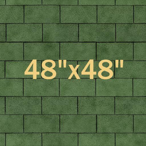
Third layer -- the above, overlaid by a a cloud image at 50% opacity set to blend using a function called soft light. I don't know how that function works but I do like what it does.
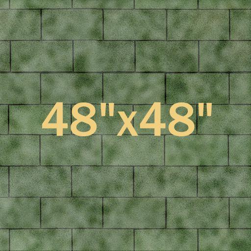
Third layer again -- only this time the clouds are using a function called hard light. Obviously not suitable.
Top layer -- the above, overlaid by a 25% opacity black layer used only to represent the appearance when it's raining. This one goes into the \snow folder and shows up only when the weather is set to snow (no snow in coastal California but (always hopefully) plenty of winter rain). Compare to the image two up, which is for dry weather.
FWIW I also did base layers I've called slate, med blue, med red, dk red, dk brown, warm brown, and dark olive.
I'll take a guess that iterating thru edit/export/aceit/viewing in OR took 8-10 loops for just this dk green, mostly trying to desaturate it w/o making it too dark. IMO it's still not right but for now its good enough. The rest remain as tentative and will stay so until I choose to use one of them. I also use a .bat file and aceit's scripting ability to make the production of all of those .ace files a snap.
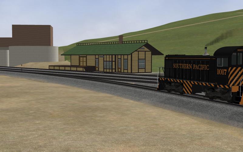
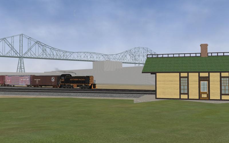
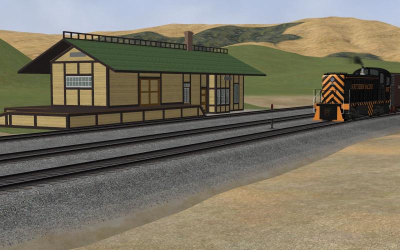
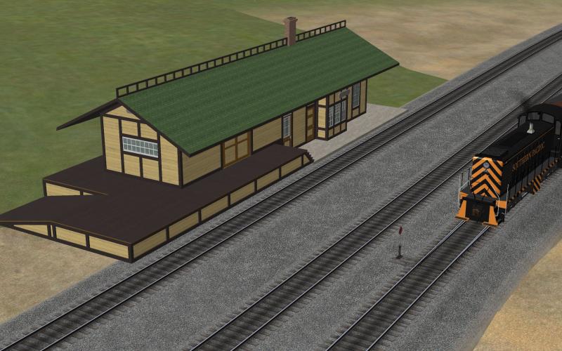
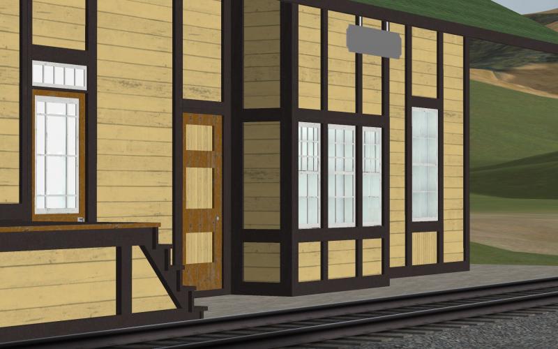
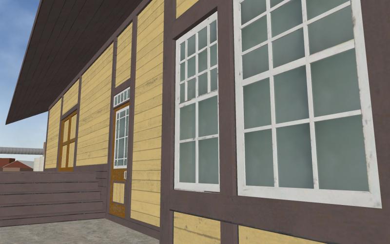
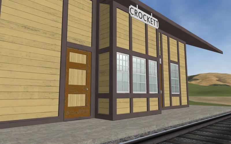
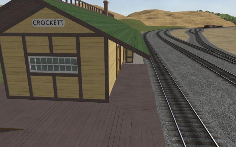
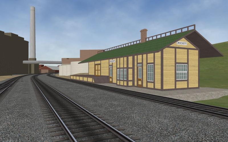
The SP Colonial Yellow wood, the SP Samoa Brown (a.k.a. buff), the SP Dark Brown and the antique white sash wood went thru all of the same sort of multi-layer processing as have most of the other 1700 texture files I use on shapes.
Needless to say I did not do any of those things when I started doing textures... I learned how to do more and more as I went, trying whatever the software would let me do, mostly out of frustration at the poor results I had been getting. I still do not regard my artistic skills as being anything more than mediocre but hand me some license free textures (see textures.com) and I know how to use my tools to make a lot more of them.
 Log In
 Register Now!
 Help
Help