Log In
 Register Now!
 Help
Help


The original map pages are something like 24x36 inches and use a scale of 1 inch = 100 feet. The digital copies (as viewed on my monitor) look to be about 900x1200 pixels and so I suppose if they were printed again at full scale I'd get 24x26 inches of printout. The USAPhotomap scale is about 125m for 512 pixels... waaaaay smaller.
So on a lark I set the Sanborn map display to 50% (these are .pdf files), did a copy, paste as image into my art software and compared to the photo map image I had there. The maps are still waaay too big. I tried resizing them to 25% of what I had. Ha! Very close. Turns out 24% is real close to being right. I dunno if that equates to 12% of the .pdf when viewed at 100% or something else... just that I know now half size in the .pdf file, reduce to 24% to match the USAPhotomap image. One problem solved.
Next problem is the Sanborn people didn't seem to care too much about which direction is north. Sometimes it is straight up on the page, often it's something completely different. That means each image I paste and resize will have to be rotated (usually several times) to get it to line up with the photo map images. Erasing a lot of the white space helps but what is necessary is setting the opacity of the Sanborn map to 50% so I can see thru to the underlying photo. With that done the rotation & examine step(s) go well enough and when I'm satisfied I reset the opacity to 100%. That problem solved.
Last issue is not to be solved: there is enough of a "fudge factor" in the .pdf files that it's hard to get them to join properly. It looks like when they were making the .pdf files somebody was pretty casual about getting the original maps to lie down flat. I was already familiar with this from the paper copies but it seems I have more patience (and greater) skill aligning two pieces of paper than I do in aligning two digital images. I have to score this one as "Oh well".
Examples. Here's a section of the route as it looks in the USAPhotomap image:
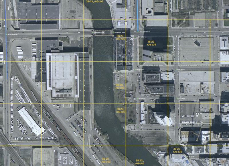
That's the North Branch of the Chicago River between Chicago Ave on the north and Erie St on the south. About the only green thing there is the water but there are a couple of tracks in the lower left corner.
Including the 1951 Sanborn Map in the image produces this:
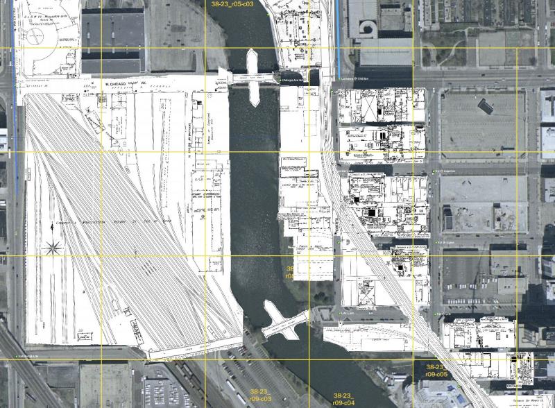
The large yard in the lower left is the obvious difference (that's a CNW yard that is the southern end of their Wisconsin Division (note turntable in upper left corner). The map also shows the MILW tracks on the eastside of the river (they're included in the operating part of the Goose Island route).
Something I didn't note before is the two bridges over the river are rather different in 1951 -- the both rotate on a center pivot. Another difference is Chicago Ave is elevated to cross the CNW tracks, as is Halsted (on the left margin going North to South). Looking again I see Erie is also elevated. Now I've looked at these pages before and I did not recognize the features for what they were, that in fact they're quite different in 1951 from what you see today.
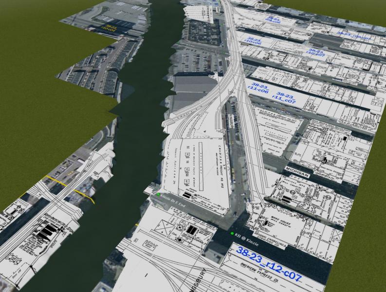
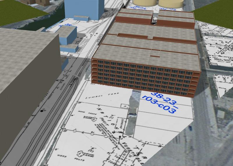
I havn't yet started the last step, which is to snip this up and turn the cutouts into tertex .aces. All that white won't look so hot but as a temporary measure to locate route features not found in any modern map, it'll be quite handy.
Q&A in the discussion forum please.